// Beach Face
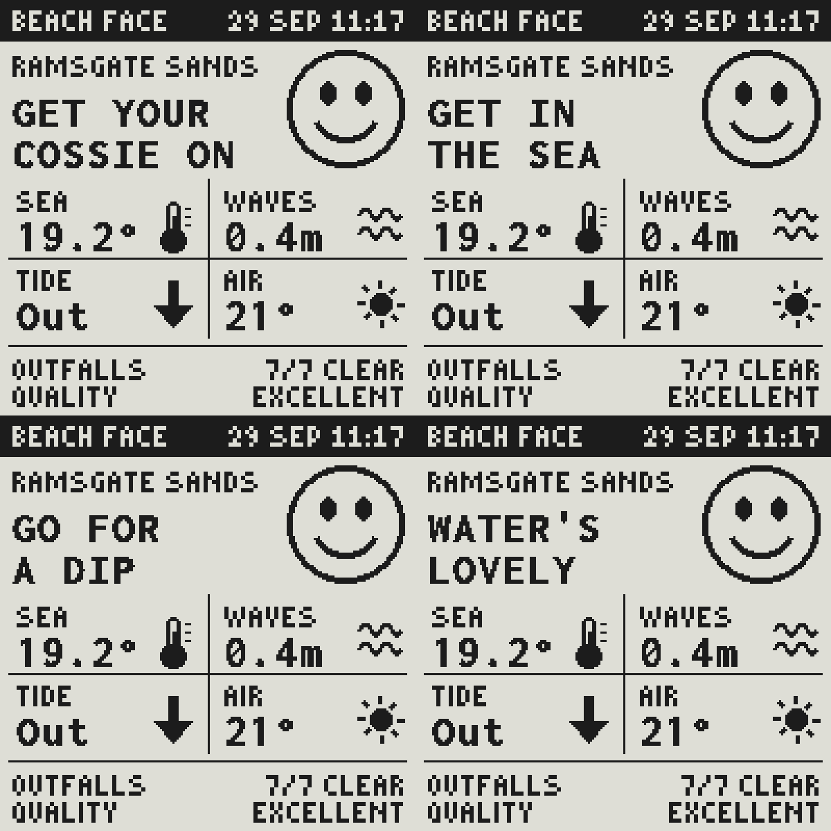
I made an e-paper screen that tells me whether it’s worth a swim. It shows the sea temperature, the waves, the tide, the air, and whether any sewage outfalls nearby are spilling. Next to all that is a simple face. Happy, flat or sad. And a two-line phrase, like GET YOUR / COSSIE ON, written by one of the language models that make up Pan on my Mac mini.
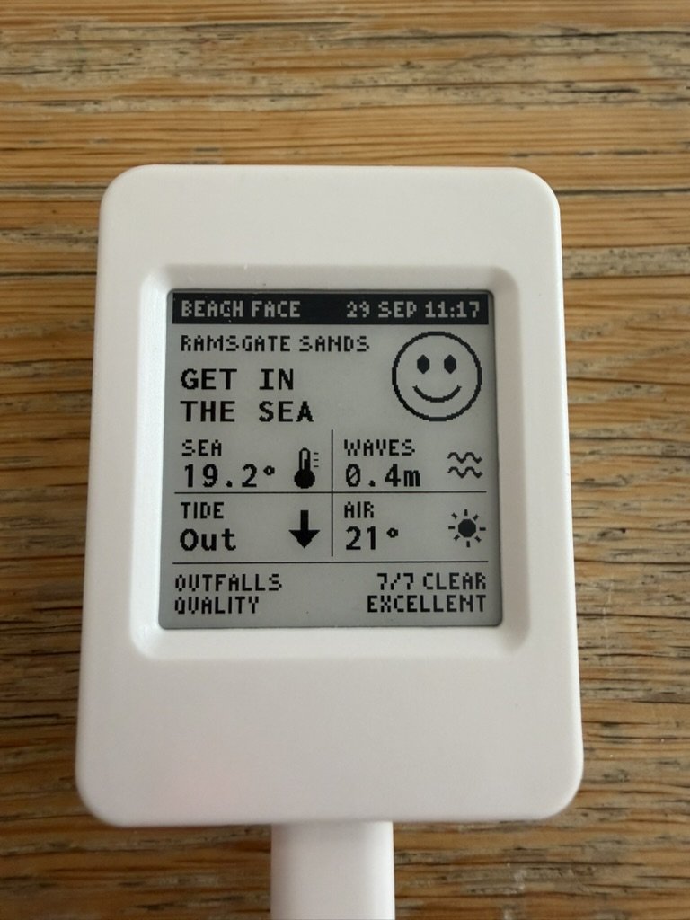
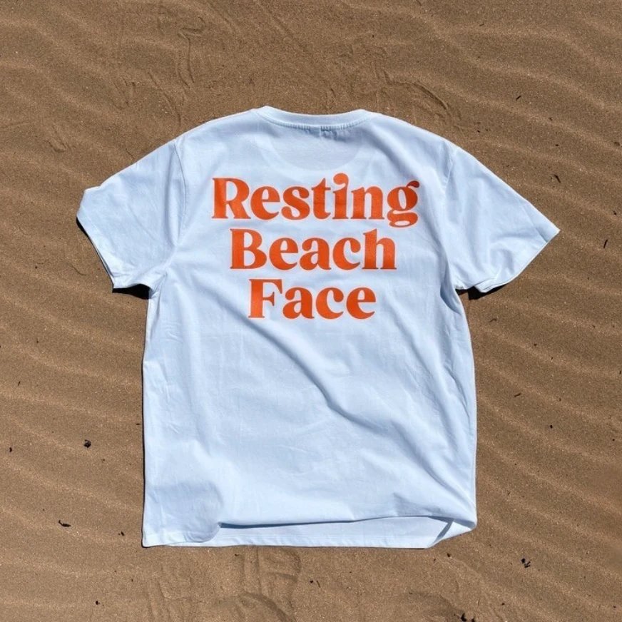
It’s called Beach Face, a nod to the Resting Beach Face T-shirt from Harbour & Tide, my partner’s business.
Also: a font chosen pixel by pixel, large language models writing micro-copy, and a face that’s sad every night.
The board
It’s a Waveshare ESP32-S3 with a 1.54-inch e-paper screen, 200 pixels square, black and white. It lives in a little white case, which is about as far from Tick’s glowing strip as a screen can get. E-paper only uses power when the picture changes. Even unplugged, the screen keeps whatever it last showed.
From the web
Beach Face started as my Thanet Beach Conditions experiment, a web page that pulls together the weather, sea, tide and sewage data for the bathing beaches around Thanet. I live in Ramsgate. Ramsgate Sands is my closest beach. I wanted that one on my desk (or on the counter of Harbour & Tide) so it can be used without opening a browser.
The first version was a static mock-up of one snapshot, the photo above. Its title went from THANET BEACHES to HARBOUR & TIDE, and then to BEACH FACE. Its verdict said GOOD TO SWIM, in a box with the same rounded corners as the buttons on this site. That got swapped for GET YOUR COSSIE ON, because that’s what a person would say. By the evening it was live.
One bit graphical interface
With e-paper, every pixel is black or white. No grey, no smoothing.
Each reading gets an icon in the same spot in its quarter of the grid. A thermometer, some waves, an arrow or a mark for the tide, and the sun, the moon, a cloud or rain. The icons aren’t finished yet. They’re placeholders generated by Claude, and for prototyping they’re perfectly fine.
E-paper is slow, and it flashes. A full refresh blinks the whole screen black and white a few times. A partial refresh changes only the pixels that need changing, with no flash, but leaves a faint ghost of what was there before. So the phrase changes every 20 seconds with a partial refresh, the clock ticks over every minute the same way, and once every half hour there’s a full refresh to wipe the ghosts. In between, the chip sleeps with its Wi-Fi off.
I love constraints. E-paper’s are interesting because the upshot is you have a screen that is a lot more ambient. It barely animates, and it doesn’t generate light. It doesn’t demand attention. Beach Face doesn’t speak out loud. Like Tick, it doesn’t need to.
Typography
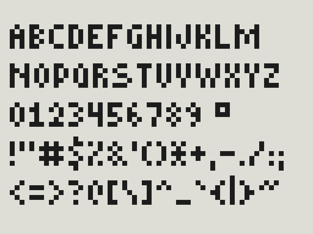
Typography is hard on a screen that can’t support antialiasing. Type has to land on whole pixels, or it looks broken.
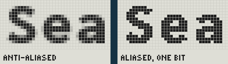
The big type is Inconsolata, the same font as this site, at 22 pixels and a weight of 850. There’s a reason for both numbers. Inconsolata’s characters are half an em wide, so at odd sizes every other letter starts on half a pixel and comes out a slightly different shape. At most weights the strokes fall somewhere between two and three pixels, so some come out thin and some thick. At 22 and 850 most strokes land on whole pixels, two or three wide.
Each letter is drawn on its own, in a fixed slot one pixel wider than the font asks for, because the usual text layout nudged letters off the grid and wide ones like M and W touched their neighbours. The phrases are in capitals so a lowercase y can’t dangle into the line below.
Two letters still came out wrong. The K sat a pixel too high, so it gets nudged down. The M sat high, too, with one thick leg and one thin one, so I picked a hand-drawn replacement from the three replacement options generated. Again, it’s not perfect, but it’s good enough for now. I’ll come back and fix it once the bigger questions are answered.
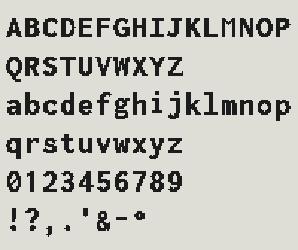
The small type is the tiny pixel font I made for my LED Matrix Simulator, at double size. It had no degree sign, so I drew one.
The face
The face and phrase are there to make the UI glanceable. They answer the question “Is it OK to go for a swim?” instantly. The rest is the evidence.
It’s simple on purpose, because it’s much easier to project onto a simple face. The more detail you add, the more it becomes someone else. The simpler a face is, the more it becomes that of the viewer. That comes from Scott McCloud’s brilliant book Understanding Comics.
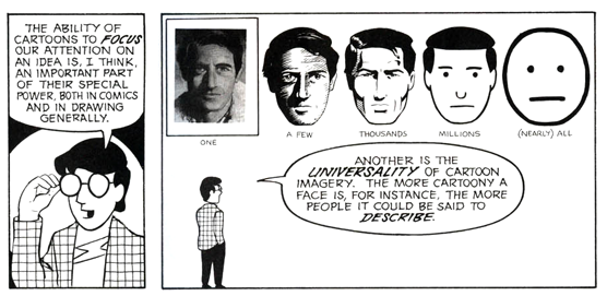
From Understanding Comics by Scott McCloud, 1993.
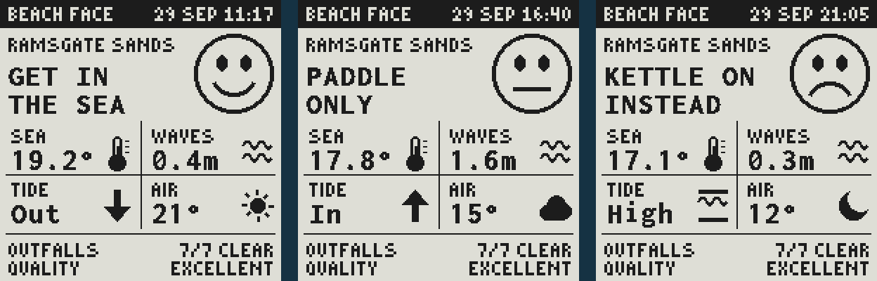
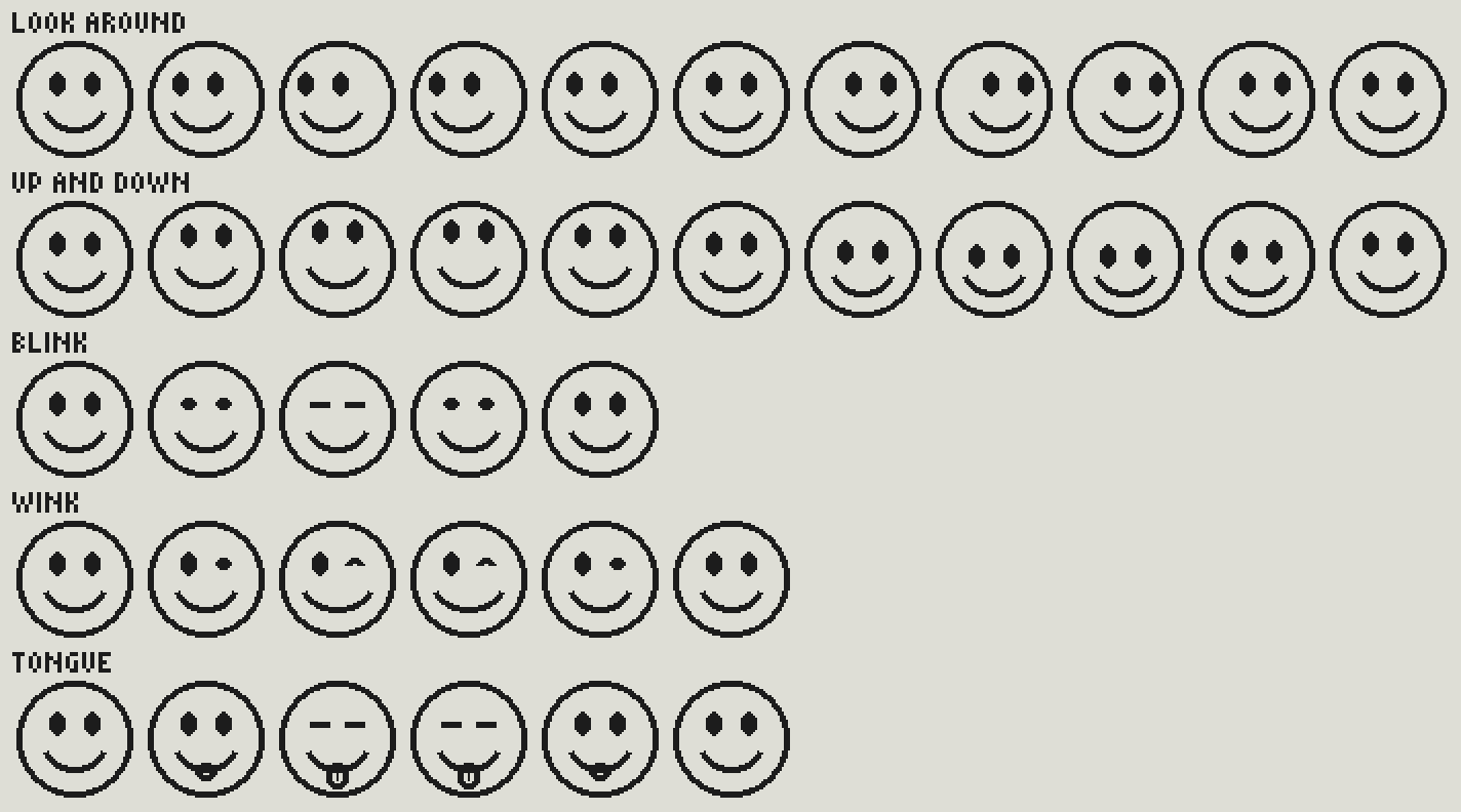
Happy means get in. Flat means think about it: rough water, poor water quality, an outfall that spilled recently, or no sewage data at all. Sad means stay out, because an outfall nearby is spilling right now. Or, for the moment, because it’s dark.
Character
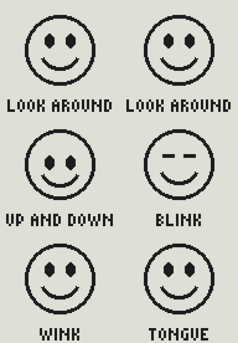
E-paper isn’t great for animating, but it can refresh parts of the screen at a relatively low frame rate. I’ve implemented very subtle animations so the face feels just that bit more alive if you stare at the screen for a while. The illusion of life is a large part of how we read artificial intelligence. If something behaves like it’s sentient, you tend to believe it is.
Tone of voice
How can we communicate character with just a few words? The phrases come from gpt-oss, one of Pan’s models. It gets a plain English description of the conditions and the face, and a brief. Something a friendly local would shout from the prom. Two to four everyday words. British, warm, dry, a bit cheeky. No numbers. On a sad day, say stay out kindly.
The illusion of life could be created with a medium-sized array of text options, but that’s not what I’m exploring. I’m looking for slight unpredictability and instability here. Testing what happens when large language models do micro-copy. More constraints as a feature!
It only gets asked when something changes that you’d notice. The face, the tide turning, the sky, the sea warming by a couple of degrees. So it runs a few times a day, and the screen cycles through the latest batch.
The first phrases were word salad. PLAY SAIL. GLAD WAVE. I’d asked it to fit each line into ten characters, and a model counting letters while trying to be witty managed neither. Now it writes an ordinary phrase, “Get your cossie on”, and the relay splits it into two lines itself. Anything that won’t fit gets dropped. It asks for 16 and keeps up to 8 that fit. If the Mac mini can’t be reached, there’s a built-in set for each face. The logs said it once attempted “Last one in’s a crab”. I love that, but constraints are constraints.
The relay
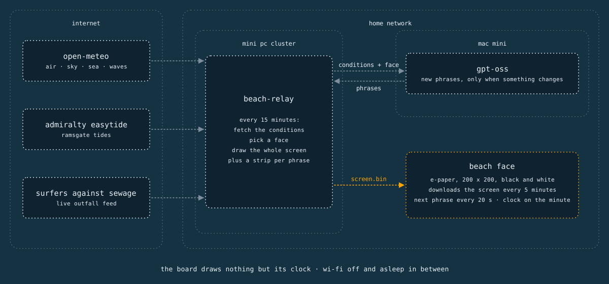
The board is deliberately dumb. A small service on my mini PC cluster, next to the one that talks to Pan’s desk board, does the work. Every 15 minutes it fetches the same feeds as the web experiment: Open-Meteo for the weather and the sea, the UK Hydrographic Office’s EasyTide for Ramsgate’s tides, and Surfers Against Sewage’s live feed of storm overflows. It picks the face, asks for new phrases if anything’s changed, and draws the whole screen, plus a strip for each phrase. The board downloads that every five minutes, about ten kilobytes, and puts it on the screen. It never reads a number or draws a letter, apart from the clock, which it keeps itself from an internet time server.
So I can change the layout, the rules, the prompt or a data source without touching the board. Same idea as Pan’s first home and Tick.
Next
Up next, I’d like to try it on a larger display. My partner has asked me if I can make a version for the shop, so I’ve ordered a red and black one to experiment with. I quite fancy putting it in a picture frame too.
The face rules need work. They’re borrowed from the web experiment, which treats darkness as a reason to stay out, so Beach Face is sad every night. Swimming in the dark is a bad idea, but a sad face at nine on a July evening feels harsh. Proper rules might look at the water temperature, the wind, the waves and how long ago anything spilled. This is more complex than it seems and I’d like to look into something like Ollaya for helping to decide what kind of message to display.
The prompt needs tidying too. gpt-oss sometimes copies the examples word for word, and once wrote TIDE’S / COMING IN at high tide.
One beach, one face, two lines. That’s plenty for a glanceable display.
I'd love to tell you more. Let's work together.